Project 9: Portfolio

Portfolio (Scribd.com):

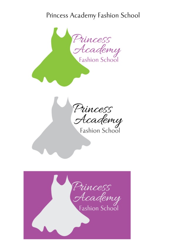
Project Corrections / Time spent: I spent an hour redoing my montage project. I used the same scripture but I used a different picture of Christ and a different background picture. The original projects wasn’t well blended and I didn’t really love the background picture I originally used. I spent 40 minutes fixing my photodesign picture. I didn’t love the original font so I found a different font and I also reconfigured the boxes so that the type wasn’t so close to the edge of the boxes. I then spent 20 minutes fixing my Logos project. The dress was much too big for the type so I shrieked the dress and I also increased the font size and chose different fonts to use.
Message: I wanted to professionally showcase my work. I want all my projects in one place so that I can easily have access to all of them when needed
Audience: Future employers as well as future clients
Top Thing Learned: I learned how to create a portfolio on InDesign to present to future employers and clients
Future application of Visual Media: I can continue to use these skills to help others and also possibly pursue a career in fields where visual media experience is needed
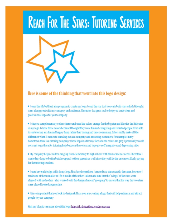
Color scheme and color names: Monochromatic; Teal
Title Font Name & Category: Stone Story; Decorative
Copy Font Name & Category: Chapaza; Oldstyle
Thumbnails of Images used:


Sources (Links to images on original websites / with title of site):


Project 8: Brochure

Front

P8-KylieHarthun- Front

Inside

P8-KylieHarthun-Inside

Back

P8-KylieHarthun-Back

Video Showcase:


Project 7: Web Page

P7KylieHarthunScreenshot

  1. Description: A webpage showcasing a logo for a company
  2. Process (Programs, Tools, Skills): I first used Adobe Illustrator to create a logo. I then used a premade css file and created an HTML file on TextWrangler to code my website. By using the eyedropper tool on Photoshop, I found the exact colors of orange and blue that appear on my logo. I used those exact colors for my typography as well as to fill in the backgrounds.
  3. Message: I want parents to use my company’s tutoring services to help meet their childrens’ academic needs.
  4. Audience: Elementary through high school aged students who need some academic assistance as well as their parents who will most likely be paying for the services.
  5. Top Thing Learned: I learned how to create/code a webpage using the css and the html files
  6. Color scheme and color hex(s): Complementary: Orange #f7941e and Blue #00aeef
  7. Title Font Families & Category: Photographs; Script
  8. Copy Font Families & Category: Americana; Sans Serif
  9. Changes made to the CSS: I changed the colors as well as the fonts
  10. Word Count: 314

Project 6: Stationary

Letterhead:

P6KylieHarthun

Business Card (large layout):

P6KylieHarthun1

  1. Description: Create a logo and incorporate it into a letterhead and business card for a company
  2. Process (Programs, Tools, Skills): I first came up with a company that I wanted to create a letterhead and business card for. I then used adobe Illustrator to create the stars logo. I then saved it and added it onto Adobe Indesign to create both the letterhead and the business card designs. I created color boxes in which I placed my company’s information. I then found two fonts that went well together and used them for my title and copy.
  3. Message: The company is a private tutoring service which gives children and teens the best opportunities possible to excel in their learning and education.
  4. Audience: Students anywhere from elementary school to high school
  5. Top Thing Learned: I learned how to create a logo on adobe Illustrator and transfer it onto adobe Indesign
  6. Color scheme and color names: Complementary color scheme; blue and orange
  7. Title Font Name & Category: Photographs; decorative
  8. Copy Font Name & Category: Timeless; Oldstyle


Project 5: Logos

KylieHarthunP5Logos

  1. Description: I designed a logo for a specific company
  2. Process (Programs, Tools, Skills): I found an image of a dress that I liked online. I then traced it using the Adobe Illustrator program. I then deleted the original image and was left with the tracing. I choose 2 fonts that I thought went well together. I also picked a color for the type that contrasted well with the color I chose for the dress. I then positioned the font and image together in a way that was appealing.
  3. Message: Fashion design school 
  4. Audience: College Students going into the fashion design industry
  5. Top Thing Learned: I learned how to trace an image with the Adobe Illustrator program
  6. Color Scheme and Color Names: Complementary; Violet and Lime
  7. Title / Body Font Names & Categories: Title- Allura; Script.                                                                                                                          Body Copy-Tenderness ; Sans Serif

Project 4 Montage

P4KylieHarthun-montage
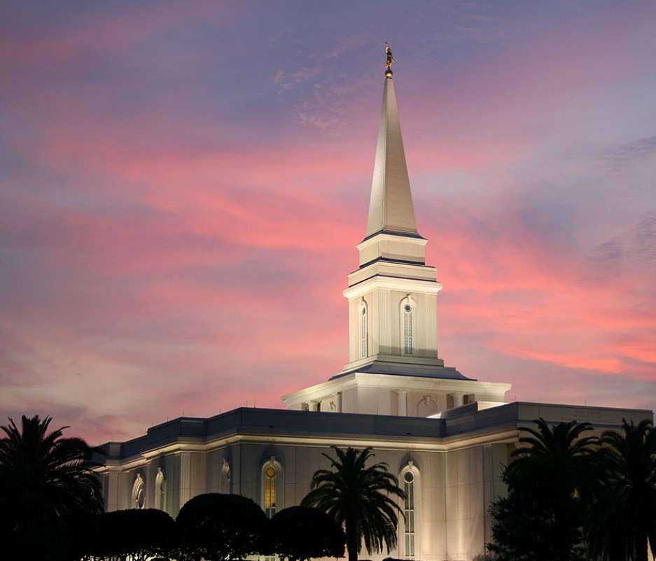
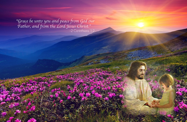
Description: On Photoshop, I combined 2 images to create a spiritual montage with a relevant scripture to go along with it.

Process (Programs, Tools, Skills, Steps taken while designing):                                                   1. I found 2 images along with a scripture that I felt went together nicely. 2. I then opened the program Adobe Photoshop. 3. I set the background image to fit an 8.5×11 paper and then I set the picture of Jesus and the child onto the background image. 4. I added a mask and used black paint and 100% opacity to remove the sharp edges. 5. I then lowered the opacity and blended the 2 images together. 6. Finally I added type and I choose a script style font for the scripture and a sans serif style font for the scripture reference.

Message: I wanted reemphasize the peace that we can find through Jesus Christ.

Audience: Anyone who is in need of reassurance or peace in their lives.                            

Top Thing Learned: I learned how to create a montage on photoshop                                    

Colorized/Filter applied and where: I selected Jesus and the child and I used the Unsharp Mask filter.                                                                                                                            

Color Scheme: Tetradic and Color Names: Gold, Lime, Indigo, Violet                                    

Font #1 Name & Category: Title- Apple Chancery Cursive- Script                                          

Font #2 Name & Category: Copy- Geo Sans Light- Sans Serif                                    

Thumbnails of Images used:

  1. Sources (Links to images on original websites / with title of site):  http://www.mrwallpaper.com/view/mountains-azalea-sunset-2880×1800/
  2. http://www.testimoniesofheavenandhell.com/Pictures-Of-Jesus/2013/04/09/jesus-picture-loving-girl-playing-hand/


Project 3: Photodesign

P3KylieHarthun

  1. Description: Demonstrate use of photography and Photoshop skills. Make an appealing design for a future employer
  2. Process (Programs, Tools, Skills, FOCUS principles): I first decided on a color scheme that I wanted and then I took a picture of the pot/flower decoration in my apartment. I then did some basic Photoshop edits such as levels, saturation, sharpen and color. I then found the quote that I felt went well with my picture and I created an 8.5×11 poster with colors from the image. I also used the eyedropper tool to pull out colors from the image to include in my color swatches
  3. Message: I wanted to create a design that demonstrated that even plain and simple things can still be seen as beautiful. 
  4. Audience: Anyone who just needs an uplifting message.
  5. Top Thing Learned: I learned how to more effectively navigate photoshop
  6. Color scheme and color names: Color Scheme: Monochromatic, Color: Brown
  7. Title Font Name & Category: Myriad Pro Italic; Sans Serif
  8. Copy Font Name & Category: Myriad Pro Bold Italic; Sans Serif
  9. Thumbnail of original, unedited image inserted:Photo3
  10. Date and location you took the photo: My apartment living room on Wednesday, February 3rd, 2016.

P3 Activity: Photography

KylieHarthun-Light-1-Outside
Light 1: Outside
KylieHarthun-Light-2-Inside
Light 2: Inside
KylieHarthun-Focus-1-Foreground
Focus 1: Foreground
KylieHarthun-Focus-Background
Focus 2: Background
KylieHarthun-Composition-01-Thrids
Composition 1: Thirds
KylieHarthun-Composition-2-Lead-Room
Composition 2: Lead Room

Photography is such and interesting concept to be because you can create an endless amount of photographs in many different styles. I enjoyed playing around with the rule of thirds technique and seeing the different types of images I could create with the same subject. It was a little challenging because everything is covered in white snow and the sky was dark today but it was still a fun challenge. I looked for a subject to use for the rule of thirds technique and I found the bike racks which I thought worked great.

The foreground and background images were the trickiest for me to shoot. I don’t know how to work with cameras very well yet but I was finally able to get the shots that I wanted. I then used photoshop to spice my images up a bit. There is still so much about photography that I need to learn but this project was a good start.


Event Ad Project

Project2KylieHarthun

  1. Description: I used Microsoft Word to create a full bleed Event Advertisement for a fundraiser dinner
  2. Process (Programs, Tools, Skills, FOCUS principles): I first scanned the image of the little girl with the easel. I then used Microsoft Word to create this Advertisement. I used the eyedropper tool to take the violet and gold out of the picture and create the boxes and lines below. It is such a great tool to be able to continue the color scheme throughout the document. I added the gold stripes to create contrast with the violet boxes.
  3. Message: I am holding a fundraising dinner to raise money for Make A Wish Foundation so that they can continue to help sick children have their final wish
  4. Audience:  Any adults in the community who want to reach out and support the cause.
  5. Color scheme and color names:  Triadic Color Scheme;  Violet, Gold, Teal
  6. Top Thing Learned: I learned how to create fliers on Microsoft Word
  7. Title Font Name & Category: Apple Chancery- Script
  8. Copy Font Name & Category: Bell Gothic Std Bold- Slab Serif
  9. Scanned images used, sources, original sizes, location of scanner used: I scanned the image of the little girl from the December 2015 Friend Magazine. The original size was 8.5×11 inches and I used a “lazerjet” scanner in the BYU-Idaho library.

Project 1: Flier

KylieHarthunproject1flier

  1. Description: Flier to promote and encourage graduates to attend a leadership conference
  2. Process (Programs, Tools, Skills, FOCUS principles): I started with sketching out ideas for my flier. I used the program Adobe InDesign to carry out my sketches. I chose the image because everyone in it seemed happy and I wanted to get people excited for the conference. I made sure there was a lot of contrast in the title as well as made sure there was a good amount of white space.
  3. Message: I want graduates to attend this fantastic opportunity to increase their leadership skills as the prepare to move forward in their careers.
  4. Audience: recent college graduates in their mid to late twenties
  5. Top Thing Learned: I learned the importance of alignment 
  6. Title Font Name & Category: Minion Pro- Slab Serif
  7. Copy Font Name & Category: Minion Pro- Slab Serif
  8. Links to images used in this project: 1. https://130.commbyui.org/wpcontent/uploads/2013/01/JuliePeterson-Leadership-conference-business-rexburg-Idaho_7530-as-Smart-Object-1.jpg  2. https://130.commbyui.org/wp-content/uploads/2013/01/VouantLogo1.png